
|
||||
|
Title and Menu Bar Concept
This is only a concept I've created in Photoshop, I have no programming skills to make this a reality. It is however something that I have been thinking about for a long time. I have always been frustrated that so much space is wasted in Windows Mobile by the Menu and Title bar. I know that apps break if you change the amount of space they can take up on the screen. My thought is if you simply tell the program to shift up a few horizontal rows, you could move some of the screen real estate to the bottom bar for more finger friendly buttons, without changing the space the application has to operate. The sample images below have the standard amount of space for the app to run in, with a just some screen space taken from the top bar and moved to the bottom.
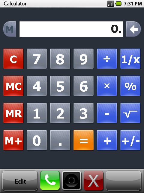 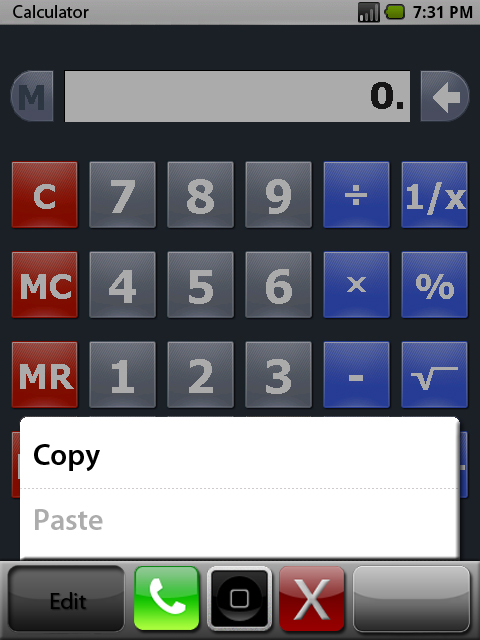 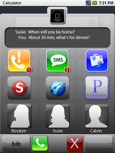 The calculator app seemed like a good generic app to use as a background. The first image is what the bars would look like throughout Windows Mobile, in every app. The bars would be a separate app running in unison with the apps running behind them. The gray buttons to the left and right would launch the menus that are linked to the running app, as shown in the second image. The green phone button would launch the dailer, and the red X would close applications since there would be no room for a close button at the top right any more. The iphone-esq home button in the middle would launch the Windows Mobile Today page when pressed, but you could also drag it upward to reveal a "homepage" within the bar application, which is shown in the third image. I imagine WAD-Like functionality of the homepage and mapping of the buttons on the bar. I think a high level of customization should come standard. Holding your finger down on the homepage and dragging to the right or left could bring up widgets. I've included the following concepts for a weather, dialer, calendar and music widget. 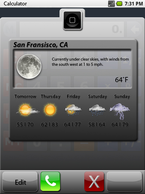 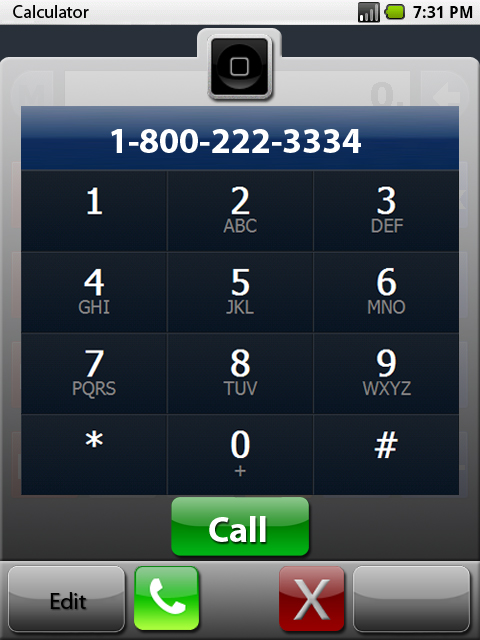 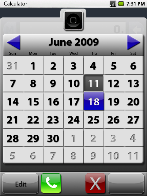 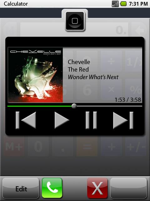 Using the entire bottom bar for buttons does create a problem. The button that brings up the on-screen keyboard is missing. However, the keyboard tends to do a good job of automatically knowing when it's needed and when it can disappear, and if you can live without the button it's not much of a problem. I have thought that a keyboard button could be worked in as an overlay of the home button when needed (i.e., when a text-entry box is selected.) 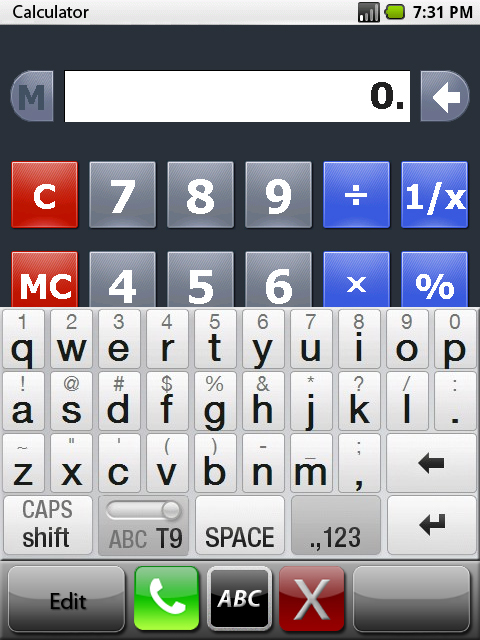 The major difference between this concept and other app launchers is that this would be available anywhere in Windows Mobile at any time, as long as the running app was not running in full screen. So many launchers like PointUI and SPB Mobile Shell look fantastic as a home screen, but their functionality ends there. This concept would go beyond the home screen as an overlay to all apps, that can be accessed anytime with a flick of your finger. Please let me know what you think, and if anyone is interested in trying to make this work, or if there is already a way out there. Thanks! -Leo Image Credit:
|
 |
|
«
Previous Thread
|
Next Thread
»
|
|
All times are GMT -4. The time now is 02:30 PM.


 Linear Mode


