| This post has been thanked 6 times. |
|
||||
|
Re: Official Palm Pre User Review Thread
The DB Review:
Form Factor/Build: Launch was handled badly. Screen is beautiful. Device face actually seems larger to me than it did in the pre-launch screenshots. Original back feels a bit cheap, but the replacement back that comes with the Touchstone feels very nice, and actually makes the phone, in general, feel a bit more solid (even though it really isn't). After a couple days, the device develops a very slight side-to-side movement in the sliding face (this has been present in both units I have owned and all demo models I have handled... seems to be standard). Overall size and form is very pleasant. The capacitive touch screen is responsive, and although it actually takes a couple days to get used to how to tap accurately coming from a resistive screen, once you do it is dreamy. My first unit overheated extremely bad while on a 4 hour trip with the GPS on while on the car charger. After that it was funky and unresponsive and I got a replacement. The second unit has been fine. Interface: The interface is amazing. No question. Basically, the entire interface is one big task manager. You are able to very quickly and fluidly, with finger gestures, switch between multiple running apps. It is very intuitive, efficient and fun. Contacts: Contacts are easy to edit, view... nice built-in picture cropper for the contact pics. You can click one letter of the hardware keyboard and easly search for the contact you want. Calendar: The ability to draw from sync all the stuff you have on multiple calendars (Google, Outlook etc) is wonderful. The calendar interface is simple and effective, but lacks a visible indicator that you have an appointment when you are in "month view", which I find to be an annoyance. Messaging: One of my favorite features of the phone. The SMS interface is threaded by conversation and message, with a nice pleasantly color coded interface. Although, I am not an IM'er... the ability to integrate your AIM chat into the same interface is there. I love texting on this phone. Email: Same simple and easy to navigate interface as with most of the rest of the phone. Was very easy to set up my Roadrunner email ac****. It autosends as soon as you go to your inbox. Haven't had any problems with it. Browser: This is a big one for me. The broswer rocks. I love it. It destroys Opera Mobile. Fast, renders beautifully, silky smooth muti-touch zooming and the double-tap auto zoom is incredibly smart and re-sizes the pages perfectly based on where you tap. The bookmarking system, which I always found to be awful in Opera, is very nice to use. There is no flash, and you cannot save downloads from the browser. Both of these are non-issues for me as I use a mobile browser primarily for information, but some people may want to take this into consideration. Camera: The camera takes great shots. Also the prep time for a fresh shot is very fast, so you are not losing shots all the time (like I did with my Diamond, which was very slow). The flash is there so you have access to low light shots. The flash does leave a bit of a yellow tint, but you can edit this out with about 30 seconds of Photoshopping. There is currently no video capture (although it is rumored that this will be added though an OTA upgrade), which, IMO, is the most glaring omission, feature-wise, on the phone. Music Player: I actually really like the included music player. It is fairly basic, but I find that it has all the functions I need (including shuffle all) and is easy to use. Accelerometer: Works fast and smooth... you never think about it happening... no lag. Does not work in all apps. Keyboard: This was the feature I was most worried about before purchasing the phone, having just seen screenshots... but as it turns out, I like it just fine and I am getting to the point where I can type pretty fast on it now. It's going to be different for each person so there isn't much point in me saying too much about this. Find a demo and try it. GPS/Nav: The GPS works great. Fast locks. The Sprint nav works very well for city travel, but for long trips it is completely worthless because it is internet based. One wrong turn in a no-data zone and you might as well have no navigation app at all, because you are lost. Hopefully, TomTom or somebody will step up with an alternative. Google maps is also there and is pretty standard, except it doesn't have an arrow by the dot on the map to show which direction you are going so that is an annoyance. Screen Lock: Having a nice screen lock app is obviously important to us. Look at all the available WinMo screen lock apps, and the amount of time that has gone into development of S2U2... and I think the screen locker on the Pre is a winner. It has a little circle that you can drag up, freely, in any direction, to unlock the screen. It shows the time and a nicely semi-shaded version of your wallpaper while locked. It gives you notifications if something new comes up... all in all very pleasant. Calling: Call quality and signal strength have been fine. No dropped calls. The dialer has nice big, responsive buttons and easy access to voicemail and call history. If you miss a call you get a button pop-up option to call the person back with one click. The screen turns off when it is close to your head and it reacts very well, no lag or anything, but can get a little annoying if you move the phone around a lot. Settings: The settings are mostly basic and easy to navigate... not a whole lot of depth of customization at all. You can drag around the icons on your launcher bar and launcher menu and put them where you want them... also you can drag quick links to contacts onto your launcher menu for quick access to favorites. You can uninstall downloaded apps, but not the default ones, which is an irritation. I really, really want to get rid of this Nascar app. Apps: I won't say too much about this here because there is a whole sticky thread about apps, but right now there are 30 apps in the app store... fairly limited. I'm sure there will be a lot more before too long though. I really like the Where app. It is like Live Search and I have found it to be very useful while travelling. That's about everything I can think of off the top of my head to talk about, but if anyone has questions, please ask. To summarize... I really love the phone. Despite some annoyances that I listed, I am enjoying it very much, and sometimes don't want to put it down. That being said... being that this is a very WinMo oriented forum, I would not recommend this phone to the majority of the people reading this... If you love the depth of customization of WinMo, if you love flashing your phone, if you enjoy wading through an ocean of options in a registry... the Palm Pre is not the phone for you. I would caution you to think hard before jumping on the bandwagon because you may miss some of those elements. For me, this phone came at a perfect time and I am very happy with it. |
| This post has been thanked 5 times. |
|
||||
|
Re: Official Palm Pre User Review Thread
I'm deliberating getting the PRE and I've scanned every post.... Most of what I see looks good. I am concerned with connectivity to the Exchange server. I saw that one person posted that they have synched with exchange but it was buggy. Does exchange push email/Contacts/Appointments to the PRE or do you have to check for updates? Do you need special software on the exchange server or will it use active sync? Anyone that has any further intel on synching with exchange as that is my primary source for contacts/email. Thanks.
|
|
||||
|
Re: Official Palm Pre User Review Thread
Quote:
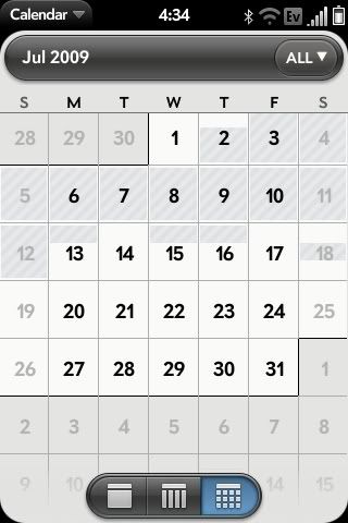
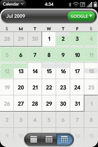
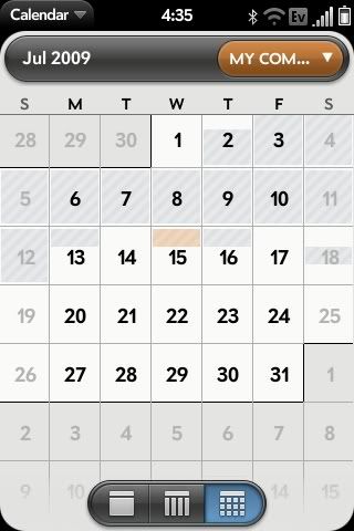
At first I also thought this was the case. It does show appointments in the month view, it's just hard to see because it is represented by a light gray shading with diagonal lines. What I found is that all appointments are grey in "all" calendar view. If you switch to a different calendar, for instance google calendar (lets assume you have google set to green), it will show all of your google appointment shaded in green on the month view and the rest will still be visible but gray.   
__________________
Palm Pre
Touch Diamond Juicy 3.7 Rom (Thanks Juicy!) Touch Pro Stock Sprint Rom |
| This post has been thanked 3 times. |
|
||||
|
Re: Official Palm Pre User Review Thread
Quote:
|
|
||||
|
Re: Official Palm Pre User Review Thread
Try looking under "Prefrences & Accounts" in the calendar app. Change the default calendar to the one you want to show all the time, then if you click on your other calendar accounts there is an on/off setting for "show in all calendar mode."
|
| This post has been thanked 1 times. |
|
||||
|
Re: Official Palm Pre User Review Thread
Thanks for the tip but it's a no go. No matter which calendar I set as the default, or which ones I set to not show, the "month view" is blank. They only show in the "day view".
|
|
||||
|
Re: Official Palm Pre User Review Thread
wow I'm at a loss, once I set those options it started showing for me...i know were going a bit off topic here but just out of curiosity, what calendars are you syncing with?
I have google as my default and then my computer through missingsync which has sub catagories of work, home and unfiled, also flixter put in a movies calendar and there is the palm profile one that is always there. |
|
||||
|
Re: Official Palm Pre User Review Thread
Quote:
|
|
||||
|
Re: Official Palm Pre User Review Thread
Mine somewhat works. If I create an event, the shading will show up in month view. However, none of my all day events or events synced from Google Calendar show up in month view.
|
 |
|
«
Previous Thread
|
Next Thread
»
|
|
All times are GMT -4. The time now is 01:54 PM.


 Linear Mode


