PPCGeeks Forums HTC Arrive HTC HD2 HTC Thunderbolt HTC Touch Pro 2 HTC Evo 4G HTC Evo 3D Samsung Galaxy S II Motorola Droid X Apple iPhone Blackberry
Go Back   PPCGeeks > Windows Mobile > Windows Mobile Software
Register Community Search

Notices


Reply
 
LinkBack Thread Tools Display Modes
  #11 (permalink)  
Old 03-22-2008, 09:40 AM
dearls's Avatar
dearls
Guest
 
Posts: n/a
Mentioned: Post(s)
Tagged: Thread(s)
Re: Face Contact - New Contact App w/ Today Plugin

Just my 2 cents.............
Nice app but found myself using the buttons to scroll though it so i could see the contacts which defeats the purpose of finger scolling, youre fingers cover all the contacts. the scrolling seems to go way to fast to be accurate. Also wish it had some type of auto hide feature like in SPB pocket plus, just dont need the contact pics covering my wallpapers all the time. Nice app but will stick with spb for now.
Don
Reply With Quote
  #12 (permalink)  
Old 03-23-2008, 06:52 AM
CareTake12's Avatar
Halfway to VIP Status
Offline
Pocket PC: Pro
Carrier: Sprint
 
Join Date: Jan 2008
Posts: 615
Reputation: 195
CareTake12 is keeping up the good workCareTake12 is keeping up the good work
Mentioned: 0 Post(s)
Tagged: 0 Thread(s)
Re: Face Contact - New Contact App w/ Today Plugin

Great app, I have a halo 3 wall paper, but when i click on the contact to make a call, the background becomes grey.... developer should fix that problem. It should keep the wall paper. another option is allow the user to change the image size of the photo contact! Anyway.... nice app!
Reply With Quote
  #13 (permalink)  
Old 03-23-2008, 10:19 AM
gabibbo's Avatar
Lurker
Offline
 
Join Date: Mar 2008
Posts: 6
Reputation: 0
gabibbo is a n00b
Mentioned: 0 Post(s)
Tagged: 0 Thread(s)
Re: Face Contact - New Contact App w/ Today Plugin

@ CareTake

Thanks for your positive feedback. This has been widely discussed on XDA-developers (you can find the link on the very first post on this thread). When selected (active) Face Contact display the solid color for a SELECTED PLUGIN as defined by the current "theme". This is what all plugins are supposed to do to signal their "active" status. Unfortunately it appears that many themes with a kind of "blackish" background (and the so-called "baseHue" parameter lacking any color) end up showing the selection with an extremely DULL grey, which is probably also your case.

We believe that having some kind of feedback of when the plugin is active is important because:

- when active you can interact with keys instead than stylus/finger
- when active you can dial by simply pressing the START CALL key, without having to perform any further tap/hold operation.

We plan to add an option with the following settings:
Selected background:
- solid selection
- half transparent
- transparent

Hopefully the half-transparent setting will reduce the "grey dullness" for those of you who have a theme lacking colors, while at the same time providing some kind of feedback about the active/inactive status of the plugin.

As for changing the image size, of course we already handle different dimensions to support devices with different screen resolutions/orientations, so it would be just a matter of exposing a reasonable UI to let the user select the preferred image size.

The first option will probably be available pretty soon. The second option may require more analysis and time to come, simply because we will have to ensure that changing the image size won't affect the size of the Face Contact preview that's shown in most of the dialog boxes.

Thanks again for your feedback.
Reply With Quote
  #14 (permalink)  
Old 03-23-2008, 10:28 AM
gabibbo's Avatar
Lurker
Offline
 
Join Date: Mar 2008
Posts: 6
Reputation: 0
gabibbo is a n00b
Mentioned: 0 Post(s)
Tagged: 0 Thread(s)
Re: Face Contact - New Contact App w/ Today Plugin

BTW: here's how the plugin looks with a theme having "colors":
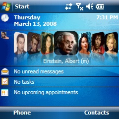


Left is the inactive (not selected) status.
Right is the active (selected) status.

Just to clarify that the "dull grey" you mention comes from the theme definition, and it's not a "dumb design decision" from us...
Reply With Quote
  #15 (permalink)  
Old 03-23-2008, 09:34 PM
winmobilelawyer's Avatar
Regular 'Geeker
Offline
Pocket PC: Touch + Mogul
Carrier: Sprint (its a love/hate thing)
Location: The Dirty Water (Waterbury, CT)
 
Join Date: Sep 2007
Posts: 384
Reputation: 80
winmobilelawyer is becoming a great contributor
Mentioned: 0 Post(s)
Tagged: 0 Thread(s)
Re: Face Contact - New Contact App w/ Today Plugin

Yea, the grey selection was one thing I noticed too. Maybe the developers could take a look at the programming from the HTC Home Plugin, in that plugin when you navigate with the d-pad you get a white border with a slight inner white glow/shadow instead of the full colored background, that would be nice looking for this app too I think!
__________________
My Mogul *used to make* me feel like... a Mogul, then i ebayed it.

And my Touch makes me feel like I am on a diet.

SKINS, WALLPAPERS, LINKS
http://mobile.meangmedia.com
Reply With Quote
  #16 (permalink)  
Old 03-24-2008, 10:09 PM
HERO's Avatar
Lurker
Offline
Pocket PC: 8925.
Carrier: AT&T
 
Join Date: Feb 2008
Posts: 9
Reputation: 0
HERO is a n00b
Mentioned: 0 Post(s)
Tagged: 0 Thread(s)
Send a message via AIM to HERO
Re: Face Contact - New Contact App w/ Today Plugin

This looks like a neat little program.
Reply With Quote
  #17 (permalink)  
Old 03-25-2008, 11:52 PM
CareTake12's Avatar
Halfway to VIP Status
Offline
Pocket PC: Pro
Carrier: Sprint
 
Join Date: Jan 2008
Posts: 615
Reputation: 195
CareTake12 is keeping up the good workCareTake12 is keeping up the good work
Mentioned: 0 Post(s)
Tagged: 0 Thread(s)
Re: Face Contact - New Contact App w/ Today Plugin

Quote:
Originally Posted by gabibbo View Post
@ CareTake

Thanks for your positive feedback. This has been widely discussed on XDA-developers (you can find the link on the very first post on this thread). When selected (active) Face Contact display the solid color for a SELECTED PLUGIN as defined by the current "theme". This is what all plugins are supposed to do to signal their "active" status. Unfortunately it appears that many themes with a kind of "blackish" background (and the so-called "baseHue" parameter lacking any color) end up showing the selection with an extremely DULL grey, which is probably also your case.

We believe that having some kind of feedback of when the plugin is active is important because:

- when active you can interact with keys instead than stylus/finger
- when active you can dial by simply pressing the START CALL key, without having to perform any further tap/hold operation.

We plan to add an option with the following settings:
Selected background:
- solid selection
- half transparent
- transparent

Hopefully the half-transparent setting will reduce the "grey dullness" for those of you who have a theme lacking colors, while at the same time providing some kind of feedback about the active/inactive status of the plugin.

As for changing the image size, of course we already handle different dimensions to support devices with different screen resolutions/orientations, so it would be just a matter of exposing a reasonable UI to let the user select the preferred image size.

The first option will probably be available pretty soon. The second option may require more analysis and time to come, simply because we will have to ensure that changing the image size won't affect the size of the Face Contact preview that's shown in most of the dialog boxes.

Thanks again for your feedback.


I think making it transparent for inactive and normal as active photo is a great feature to implement. Could you allow the user have the option to use there wall paper instead of the grey background... As a developer, there two things you need to keep in mind, function and the design of it. You have both but that freaking grey background made my today screen look crappy. If you do decide to keep the grey background, please allow the user to deactivate the greyscale by touching the grey area or make it unactive in 3 seconds or so..... That my two cent... well keep up the good work. Hope you make millions..
Reply With Quote
  #18 (permalink)  
Old 03-26-2008, 11:00 AM
gabibbo's Avatar
Lurker
Offline
 
Join Date: Mar 2008
Posts: 6
Reputation: 0
gabibbo is a n00b
Mentioned: 0 Post(s)
Tagged: 0 Thread(s)
Re: Face Contact - New Contact App w/ Today Plugin

Hi CareTake,

as I wrote, we're already considering adding more "background options" (see the list in my previous post).

But once again, please note that's not *us* who decided that the selection color should be "dull grey"... that's a definition in your theme.

As it is now, we just used the color that's defined by the theme to show an active/selected item.
I guess all your other plugins use the same color when they are active/selected.

One final note for people using UL.
I personally spent quite some time yesterday playing around with UL version 1.2 (English), and actually it seems that Face Contact never shows the solid selection color when used within UL (this was also reported by Jomo25 in the XDA-Developers thread).

Anyway, thanks everybody for your feedback and ideas.

Reply With Quote
  #19 (permalink)  
Old 03-26-2008, 11:13 AM
bedoig's Avatar
VIP Member
Offline
Pocket PC: HTC Evo
Carrier: Sprint
Threadstarter
Location: Houston, TX
 
Join Date: Aug 2007
Posts: 1,106
Reputation: 1096
bedoig is halfway to VIP status based on repbedoig is halfway to VIP status based on repbedoig is halfway to VIP status based on repbedoig is halfway to VIP status based on repbedoig is halfway to VIP status based on repbedoig is halfway to VIP status based on repbedoig is halfway to VIP status based on repbedoig is halfway to VIP status based on rep
Mentioned: 0 Post(s)
Tagged: 0 Thread(s)
Re: Face Contact - New Contact App w/ Today Plugin

Quote:
Originally Posted by gabibbo View Post
One final note for people using UL.
I personally spent quite some time yesterday playing around with UL version 1.2 (English), and actually it seems that Face Contact never shows the solid selection color when used within UL (this was also reported by Jomo25 in the XDA-Developers thread).

Anyway, thanks everybody for your feedback and ideas.

I noticed the same thing. It does not show the solid selection color when you scroll Face Contact when it is used within UL. It also will not automatically jump to the appropriate contact when you press a keyboard letter. It would appear that UL interferes somehow with Face Contact ever being truly selected by scrolling it with your finger.

You can, however, force Face Contact to be selected by navigating to it with the d-pad on your phone. It then shows the solid background color and will navigate with letter key presses.
Reply With Quote
  #20 (permalink)  
Old 03-31-2008, 09:09 PM
jbbosu's Avatar
PPCGeeks Regular
Offline
Pocket PC: HTC Mogul
Carrier: Sprint
Location: Oregon
 
Join Date: Oct 2007
Posts: 246
Reputation: 15
jbbosu is a n00b
Mentioned: 0 Post(s)
Tagged: 0 Thread(s)
Send a message via AIM to jbbosu Send a message via MSN to jbbosu
Re: Face Contact - New Contact App w/ Today Plugin

I wish you could import ALL contacts at once, rather than one at a time..

Great app tho
Reply With Quote
Reply

  PPCGeeks > Windows Mobile > Windows Mobile Software


Posting Rules
You may not post new threads
You may not post replies
You may not post attachments
You may not edit your posts

BB code is On
Smilies are On
[IMG] code is On
HTML code is Off
Trackbacks are On
Pingbacks are On
Refbacks are On


All times are GMT -4. The time now is 05:24 PM.


Powered by vBulletin® ©2000 - 2024, Jelsoft Enterprises Ltd.
Content Relevant URLs by vBSEO 3.6.0
©2012 - PPCGeeks.com