Quote:
|
Originally Posted by storyr
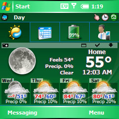
Ok, here's a "beta" version to try - before I publish it for general consumption. Check it out and let me know what you think.
Note: I've only run SPB Mobile Shell (beta 1.5) and this WP theme on an emulator - not my Treo. That's why I'd like you to try it out. Because it's fairly tall, I'm interested in how well it fits - particularly without hideLogo. I think it looks pretty good, and it really can't be shortened without losing the concept.
Please post screen shots with your questions/issues...
Enjoy!
|
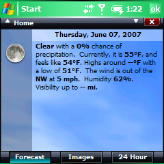
Looks great to me! I used Hidelogo but also had PhoneWeaver in it's place, so it was still pushed down by one-line and everything fit. I'm loving those secondary screens.

