Quote:
Originally Posted by santod

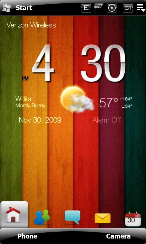
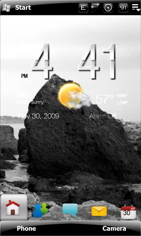
Ok, here is the latest on how this clock is coming. I now have it mostly white, partially semi-transparent and shaded. It has a slight black drop-shadow effect, to help make it stand out better on lighter backgrounds.
I have cleaned it up to where I am fairly happy with it now. I still need to either remove the AM/PM, or make it white to match all the other font. I will probably just make it white and call it good.
Any opinions?
This gives an idea of how it looks up against different colors:

And this gives an idea of how it looks on a light colored background:
 |
Looks awesome, will keep my eyes open for this one!